Portfolio Overhaul
Why
I made my initial portfolio site years ago in vanilla HTML/JS/CSS. Every time I looked back at it, I thought it could be improved in looks and definitely in code. Since its initial release, I've become much more proficient in front end development, especially React and Tailwind. I decided I would take what I learned from migrating eef.app to Next.js (see this post) and redesign my portfolio site! If you want to see how different the old version looked, skip to here.
Ideas
Problem #1: if I don't like the old design, how do I figure out what design I do like? I started looking around for inspiration from other people's portfolios and just well designed websites in general. Below are a few examples that stood out to me as you may notice some similarities to them here and there. I noticed that a lot of portfolios tended to have over the top effects that often were choppy or didn't work on mobile due to how intensive the effects are. The design goals I landed on were: sleek/simple, responsive, easy-to-use.
How
I scrapped the entirety of the original code, so this wasn't really a "migration" to Next.js. I started with a fresh Next.js app and got to work. I was already familiar with React, Tailwind, TypeScript, etc. so I only had learning to do in terms of Next.js.
Hosting
I had already been hosting this site with GitHub Pages so nothing needed to change there. With Next.js, it is super easy to set it to be built as a static site as GitHub Pages requires. For anyone reading this that want's to make their own website, Next.js SSG -> GitHub Pages is a breeze and I highly recommend giving it a try.
GitHub Actions
The trickiest part of hosting for me was CI/CD. I'm not super familiar with GitHub
Actions; but it was fun to learn a little of it to get this site to build and deploy
for me. Whenever I push to my main git branch, GitHub Actions will automatically
build and deploy the new version to GitHub Pages automatically. It's super nice.
I am also able to ensure builds succeed as I have a GitHub Action to validate PRs.
Blur Issues
One design issue I ran into was related to the blur effect used throughout the site.
It turns out that different browsers handle overlapping blurs differently. I use
Zen Browser (highly recommend btw) which is a fork of
Firefox. While developing, everything worked as I intended on Zen/Firefox. After
hours of development to get it deployed, I tested it on my phone and found that
the blur looked wrong in a few spots. To solve this, any directly overlapping blurs
are actually not blurred. For example, any cards within cards are just something
like bg-white/5 (Tailwind speak for a touch of white). This can be seen in the
bento cards on the home page. Any pop ups like the navbar or filters have another
blur as their positioning is handled differently to child elements.
Blog Posts
My goal with these blog posts was to make it as easy as possible to write and a post
and publish it via tools that I'm familiar with. I'm comfortable with git and Markdown.
So the goal was to have a directory of Markdown files that would directly turn into
blog posts. All I have to do is create a new Markdown file in this directory.
Once that file makes it to my main git branch, it will automatically show up on
the site!
Dynamic Routes
To accomplish this, each blog post needed its own route. Using dynamic routing in
Next.js, Markdown files are given their own pages. For example, this file
portfolio-v2.md is mapped to https://ethantchristensen.com/blog/portfolio-v2.
Markdown Rendering
Now comes the tricky part of turning Markdown files into HTML. This is made easy with the help of unified, remark, and rehype. These libraries handle the conversion of Markdown to HTML. Unified uses remark to go from Markdown to HTML. Rehype is then used to get the HTML usable for React rendering.
Slugs/IDs
For long Markdown files, a table of contents is nice to have. This requires
making links to different headings in the Markdown file. rehype-slug
to the rescue! This makes it so that each heading in the Markdown file has an id
prop in the corresponding HTML. This way, linking to headings is as easy as:
// Table of Contents

- [Example](#example)

// ...

// Heading

# Example
Which turns into:
<ul>
  <li>
    <a href="#example">Example</a>
  </li>
</ul>
<!-- ... -->
<h1 id="#example">Example</h1>
The resulting unified/remark/rehype setup I ended up with is:
const processedContent = await unified()
  .use(remarkParse) // Parse markdown
  .use(remarkRehype) // markdown -> HTML
  .use(rehypeSlug) // Use slugs
  .use(rehypeStringify) // Serialize HTML
  .process(post.content); // Execute
const contentHtml = processedContent.toString();
Front Matter
Using front matter to add metadata to the Markdown files, I can easily add timestamps, tags, links, images, and more to the posts. This is helpful for organizing and filtering posts. You'll notice this being used in the blog list page page in the filters and in the post previews. You'll also see this metadata used at the top of each blog post.
Server vs Client Code
Before this project, I had mostly been familiar with single page applications which use client-side rendering. Next.js can be done with server-side rendering (SSR). This took some getting used to, but it is actually quite nice. It also helps push developers towards small, distinct components. Anything that a user might interact with, say a list filter, should be a client-side component as it needs to handle the state of the filter in the browser (i.e. client). Anything that won't directly use client interaction, like the blog posts, can be server-side rendered. Anything server-side rendered removes any JavaScript from the page, so the client just gets the resulting HTML. I'm still learning the best practices for this. It's been super fun and cool to learn SSR and see how much I could improve all the client-side code I've worked with in the past.
An example of this is the blog lists page. The list of blog posts must be server-side as the server is the one that knows which posts exist. The filtering must be done client-side as the user is the one that interacts with the filter. The end result is a server-side rendered page that gets the post data and renders a child, client-side component that uses the passed data to render the list of posts.
Inline Code vs Code Blocks
Thanks to this discussion, I was able to handle inline code and full code blocks separately in Tailwind. Converting this to Tailwind v4 looks like this:
/* Ref: https://github.com/tailwindlabs/tailwindcss/discussions/12496 */
@custom-variant prose-inline-code {
  &.prose :where(:not(pre) > code):not(:where([class~="not-prose"] *)) {
    @slot;
  }
}
This allows me to style inline code like this: prose-inline-code:px-1 without
the full code block receiving that Tailwind class.
Results
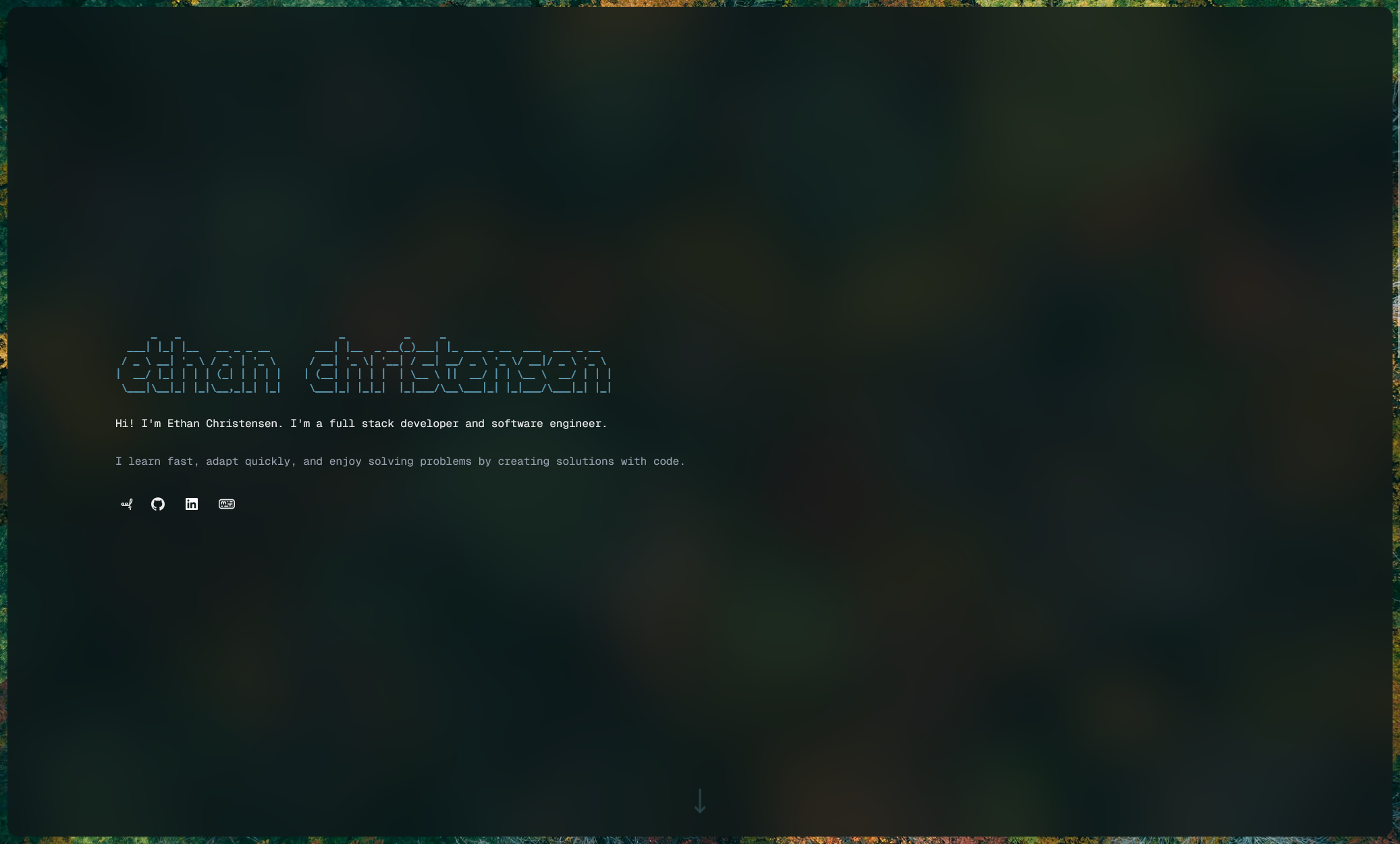
You're already on this site, so you're seeing the new design. Check out a glimpse of the old one to see how much it has improved!
Old
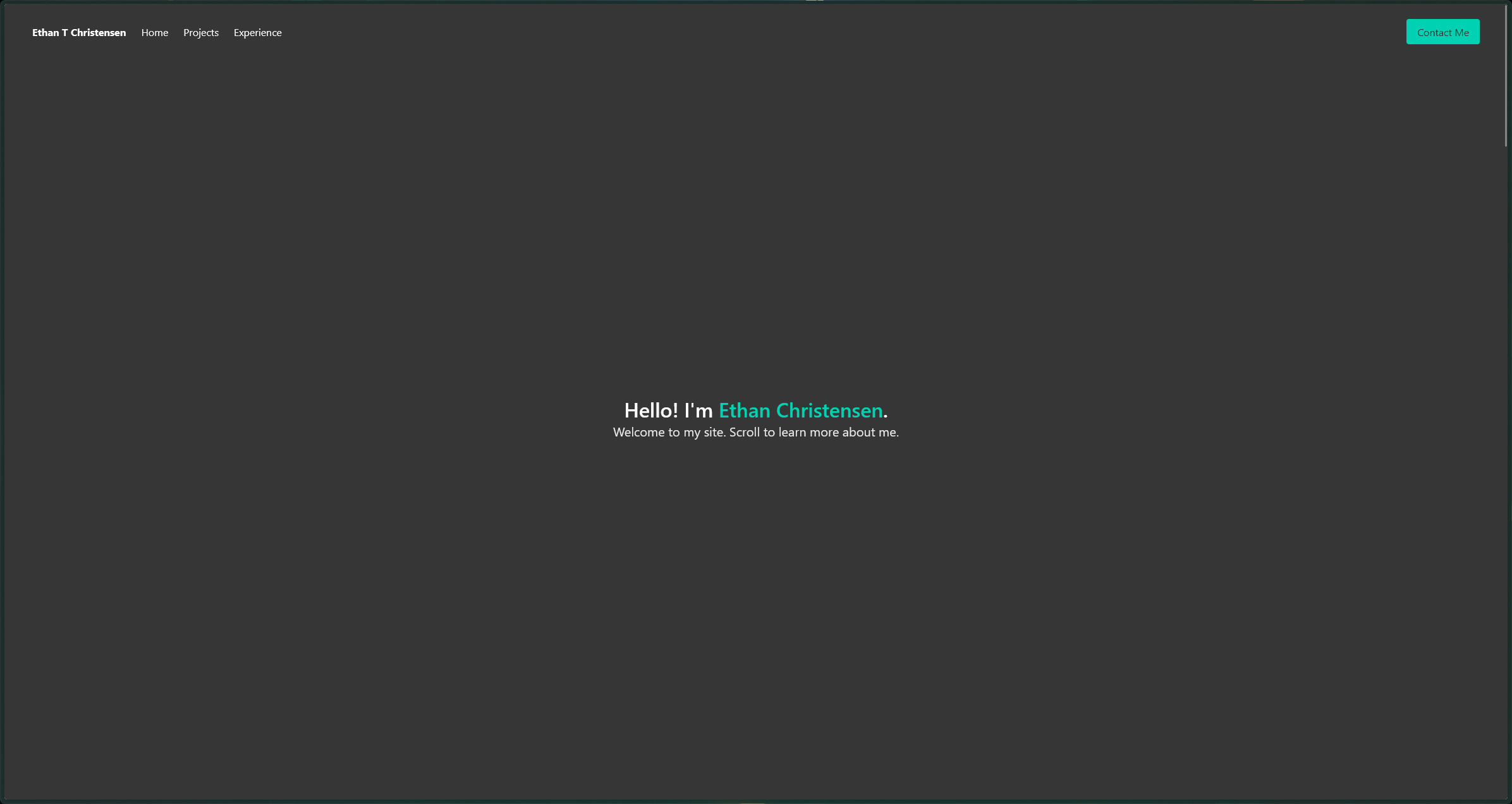
New